WEST COAST BALANCE HEALING
Designed in collaboration with Lovely.Studio
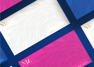
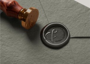
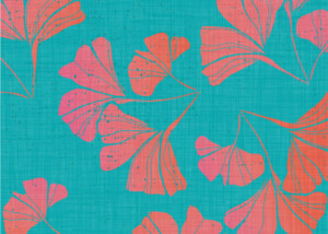
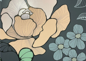
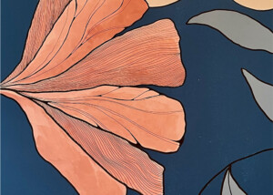
I was absolutely thrilled when Lovely Studio asked me to help with this design project! Upon meeting our client for the first time, I learned very quickly how much of a positive and approachable person she was and it was imperative that her branding would reflect this. A bright colour palette would play an important role as it would be reflective of her beautiful spirit. We would also draw inspiration from the breathtaking landscape that surrounds us here on the West Coast.
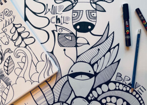
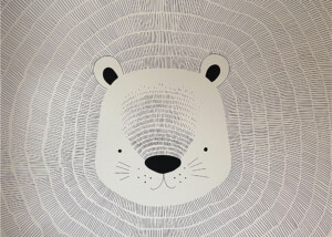
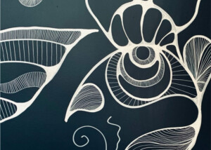
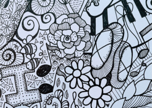
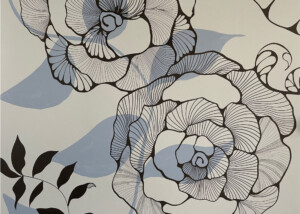
Art plays such an important part in the design process. It can help to inspire and uplift us, and it is a truly genuine way to get in touch with our feelings. For this project, we decided to step away from our computers and bring out our paints and brushes. We were more in tune with our feelings as we embarked on this exciting and creative journey. The paintings that came out of this design process were inspired by the breathtaking outdoors – blue skies, bright florals and calming seas. Through the use of a brighter colour palette and hand drawn elements, we were able to create a design that offered more interest and dimension and was a true reflection of West Coast Balance Healing’s supportive nature.